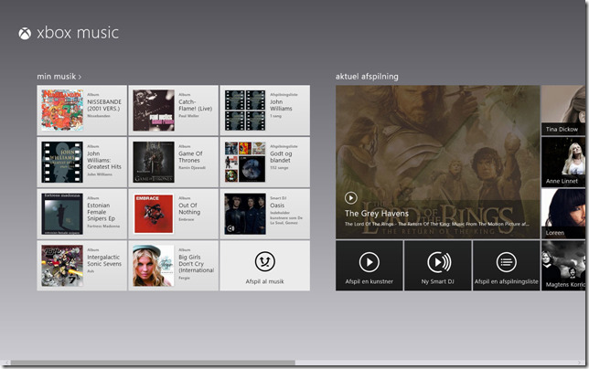
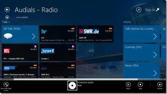
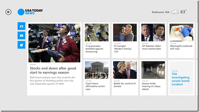
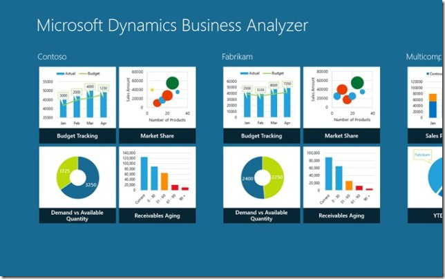
I want to make my Windows 8 app look good. That’s hard to do for any app and even harder given the structure that everyone expects to see in a Windows 8 Store app. Here are some images that I am using for reference to help me design a good looking and functional app.
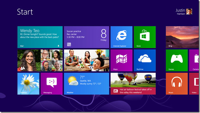
The Style That People Expect
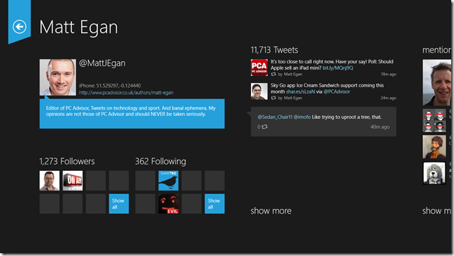
A Clean Look – Thanks Matt
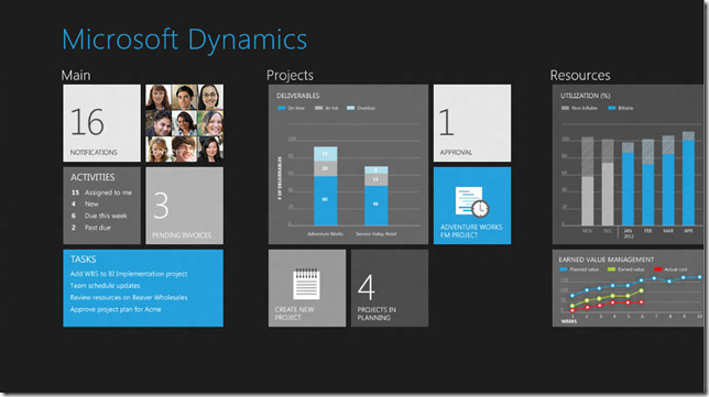
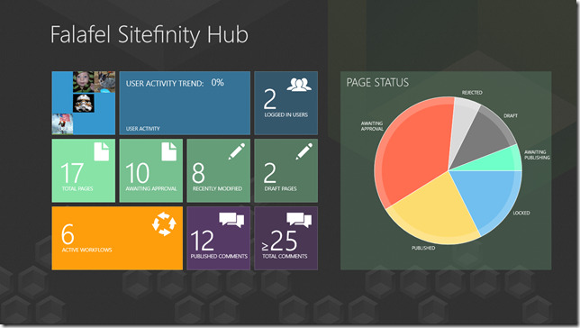
More From Microsoft – Tile Size Variations
Possible Background Idea – Lines
A Lighter Background – Maybe Too Simple Looking
More Complexity – Image Background
Another Light Background – Simple is OK
Another Color Variation – Too Repetitive?
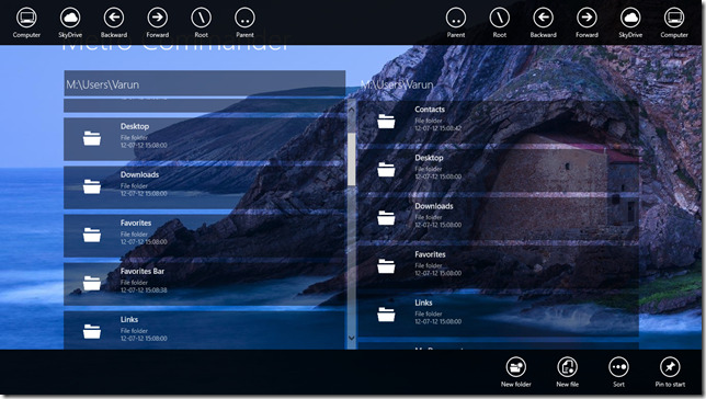
App Bars – But Too Much Transparency is Bad
Good Transparency and Background Concept – Nice Colors Too
I will add some more images and I find them. I would like to have a collection that will help me find a good look for my app that has a good balance of simplicity and complexity.
Leave a comment

