The Windows Phone supports two types of controls that a user would think of as panoramas. One is called, of all things, a Panorama. The other is not so obviously called a Pivot control.
Panorama
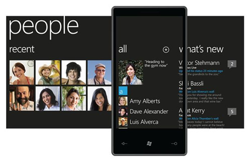
I am borrowing some images to describe the Panorama control first. Anyone who has used the Windows Phone for more than a few minutes will have encountered a panorama. Here is an example of how the phone screen is used to view a larger panorama of content:
 This is an interesting method of displaying data and only has a few minor shortcomings. One is that the title, “people” in the picture above, is not visible once you move far enough to the right in the content. The other shortcoming is that you cannot get a very good feel for what is to the right or left when viewing some parts of the data. A quick move of the finger gets you to the unknown data and it’s probably easy to remember after that.
Microsoft documentation says that there should not be an application bar at the bottom of the screen because the Panorama is a navigation feature, not some sort of interactive content.
Pivot
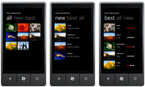
The Pivot control is very similar to a panorama. You may have encountered a Pivot control and not cared or not noticed the difference. The pivot cannot show more than a single page of content at a time:
The image above is not like the image for the Panorama. The only thing that has any sort of Panorama effect is the header information where multiple page titles can be seen at the same time. They can even be tapped to get to the selected page. The obvious shortcoming is that the screen is just displaying one page at a time. There is an order to the pages and swiping left and right can change the page, but it’s not a Panorama. There is no background image or title that shifts in a visually slower manner than the page content. The benefit is supposed to be better speed when drawing the screen.
Microsoft documentation doesn’t talk about an application bar being a good or bad idea for a Pivot control. At least I have not seen any yet. Since the Pivot is very similar to a Panorama, I’m not sure what is best, but I have an application bar in some cases (in the app that I am writing) and even a footer that has text content that does not scroll at the bottom of some Pivot page groups.
Comparison
A comparison of the two yields one important fact; they are so similar that they probably confuse some people.
I am not sure how to decide which is the best choice for an app. Clearly, the top image on this post is a good example of a Panorama. There is content wider than a single screen that lies on a page that is much larger than the screen. The content is not edited and is used to access other parts of the app. The bottom image, on the other hand, could just as easily have been built as a Panorama instead of a Pivot.
I hope to post some images of my own app as soon as I find out if there is anything proprietary in it. I am writing it for a client who is providing it to a very large computer software company and they might not want me posting about it just yet.

