Form Test Page
The Windows Phone 8 app that I have been working on for a while now has forms with required fields. Only a subset of fields are required, but there are no marking to indicate this.
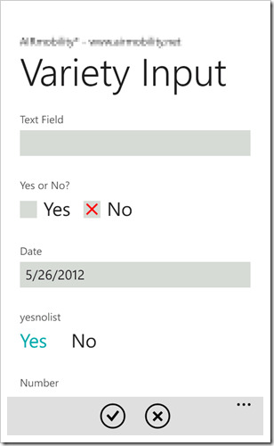
In the image above, you can see a test page in the Variety Input form. This is a tall page that scrolls vertically and there are a large number of fields representing the various types of input a user might be asked to use in the form.
If the Text Field field were a required field, it would look identical to an optional text field. After looking online at example of forms with required fields, I have come to realize that most people don’t really care about how their forms look.
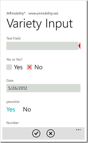
Red Arrow Option
The best option that I have come up with, so far, is to show a red arrow on the right side of required fields at all times. Markings on the left throw off the alignment of the fields which makes this a good option.
The one thing I don’t want to do is clutter up the interface:
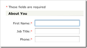
Clutter!
The new style that Microsoft has adopted for all of the Windows, phone, tablet, or desktop, is a modern user interface that is simplified from what was used before, There is little or no chrome, the decorations around elements, and things like colons are just not appropriate or necessary. the asterisks in the above form are not that bad, but show a page in my app with two columns and a lot of form fields, and the whole ting might look confusing.
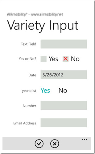
Two Column Form
Two columns results in a lot of information on the screen already. Add any sort of useful marking next to the text and it would lose the visual appeal that it gets from it simplicity.
Internationalization
Or nationalization, depending on your point of view.
I have a dilemma of sorts. The forms for this app are sent from a server. the phone simply follows some rules and instructions to display the form and has no visibility of the nationality of the form text. Because of this, it was easy to change languages in the forms. if the phone user interface is set to be in Spanish then the language code, "es" in this case, is sent with the request to the server and the server sends back a Spanish version of the form. Unfortunately, the "Yes" and "No" for the two type of yes/no fields are hard-coded into the app. Although I have added the necessary resources and code to show this in English and Spanish, I’ll need to translate to a bunch of various languages to be consistent.


