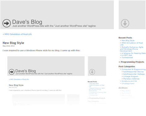
I was inspired to use a Windows Phone style for my blog. I came up with this:
It’s not really the Windows Phone style but it does move towards the simplicity that I see on the phone and on the Windows App Hub site. The choice of color for the links was the most difficult decision because it needs to be distinct from the rest of the text yet dark enough to be readable. I think it is still a little too light but I’ll keep this for a while and see how it looks in a few weeks.
I also opted to remove the outlines of the various areas to see how it would work. It’s almost beyond simplistic.
Leave a comment

